top of page

Task 12
Task 12
Task 12
Task 12
Task 12
Task 12
This was my initial attempt at designing a library that would be community orientated and try to draw more people into the library. However this was unsuccessful as the bridges made it less community oriented as people were confined to tight passage ways based on my feedback.
This was my initial attempt at designing a library that would be community orientated and try to draw more people into the library. However this was unsuccessful as the bridges made it less community oriented as people were confined to tight passage ways based on my feedback.
Task 13
Task 13
Task 12
Task 12
Task 12
Task 12
Task 20


At this point my library had a lot of warmth to it and started to feel really inviting and had a strong architectural language that also responded to my concept strongly. The public spaces created were with respect to the front of the library and the grass areas that is often used by the public to sit and relax on. In a similar manner I tried to extract this important aspect of the library and spread it throughout.
.png)
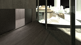

These views show both from a persons perspective and from a neighbouring buildings perspective of hoe the library functions a as something that thrives to easily guide the public throughout the library. It also shows the new facade that Is much much more engaging to the public apposed to the previous flat facade of just a square building with no resemblance to the front of the building in any way.

This view was one of the best views for the entire project as it strongly showed the correlation between the exterior and interior as public space that worked with one another. It also strongly shows the architectural language of the design itself that remained consistent throughout the entire library.

bottom of page